PROBLEM
Museum of Ice Cream, a Figure-8 brand, is an interactive art museum with ice cream and candy-themed installation. However, as the company has expanded nationally and more venues have been built, I noticed its website has several problems:
1. Redundant contents and messy site architecture
2. Miss out the opportunity to stay connect with guests
3. No clear distinction between venues
4. 3rd-party ticketing system with no personalization outreach
USER
In order to understand the reason of visiting the website, a survey was conducted to MOIC community through Instagram. The following two personas are based on interviews and surveys.

Key Insights:
HIERARCHY OF NEED
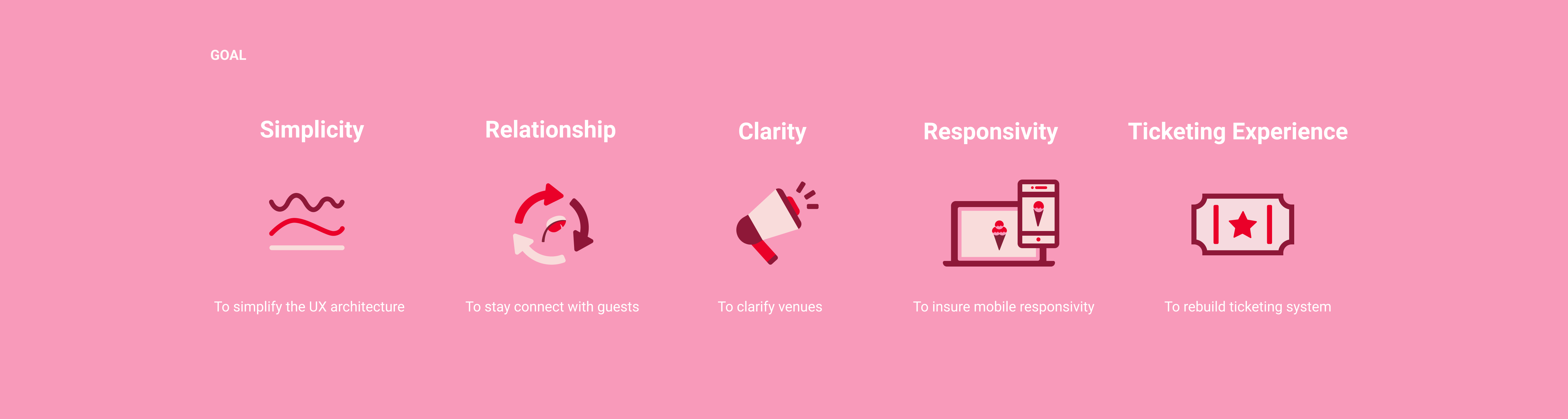
After the research and user interviews, Our team came up with the hierarchy of needs for the website.
1. Ticketing experience
2. Our Brand
3. E-commerce/Shop
4. Ice cream line
5. Others like MOIC partnership etc.
LANDING EXPRIENCE

Three versions of landing page were created for design critic. All designs are based on the design principle(branding) and the hierarchy of need. The team finally pick the version three based on the usability test. Want to know more details? Please check the full case study 👉.
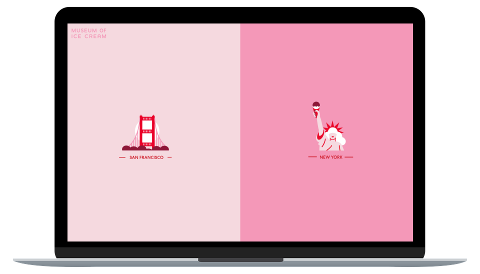
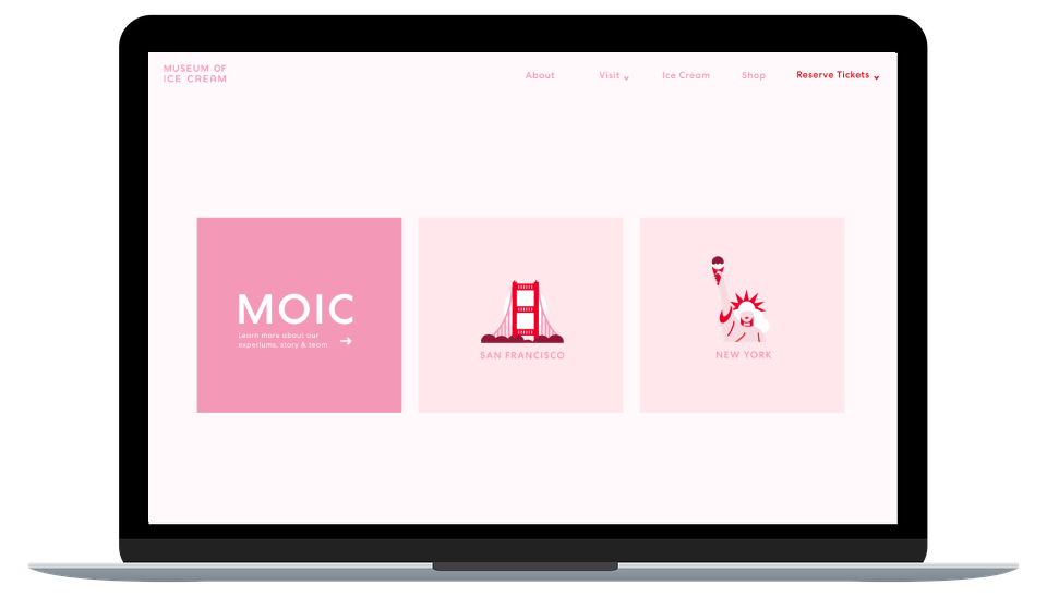
Version 1: Location Only
Barry Schwartz, a professor and author from Swarthmore College showed that too many options can lead to stress, anxiety, and discontent. Since no one gets happier with the maximum freedom of choice in this information-overloaded world, we try to limit the freedom of choice in this scheme. Users only need to have one action: choosing the location.
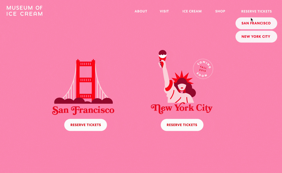
Version 2: Small Location + Brand
In the second scheme, the location step became secondary. "What is MOIC?" and "What to expect in MOIC?" became the main content. Lots of information and buttons appeared on the home page. This version designed for the guests who don't understand our museum.
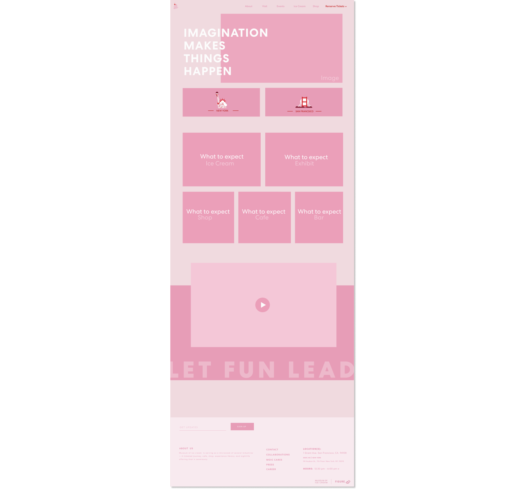
Version 3: Location + Menu
The last scheme is a neutral version of the first two. Only one step can guide the users to the about page of the company to shop the merchandise as well as the ice cream line, or to browse the specific information of different venues.
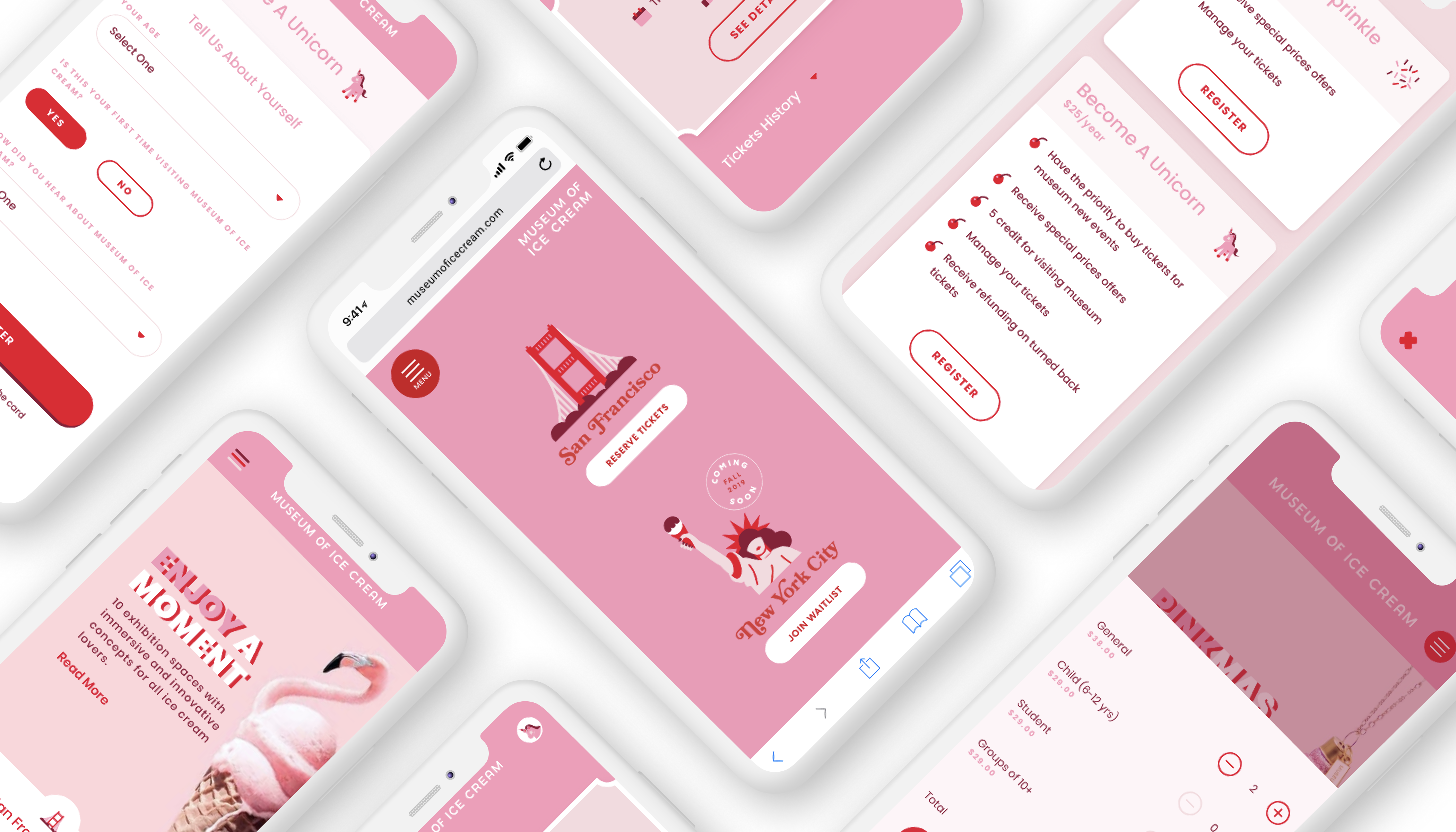
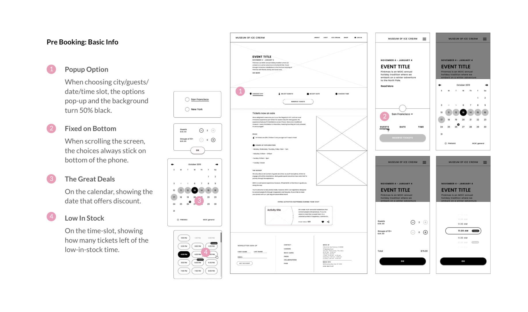
TICKETING EXPERIENCE

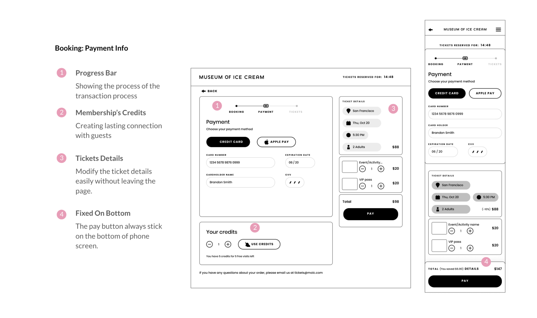
Improve Performance
Compare to the old version, the new version has more consistent UI and shorter steps to purchase tickets, saving more time for the users, and visually pleasing our guests.
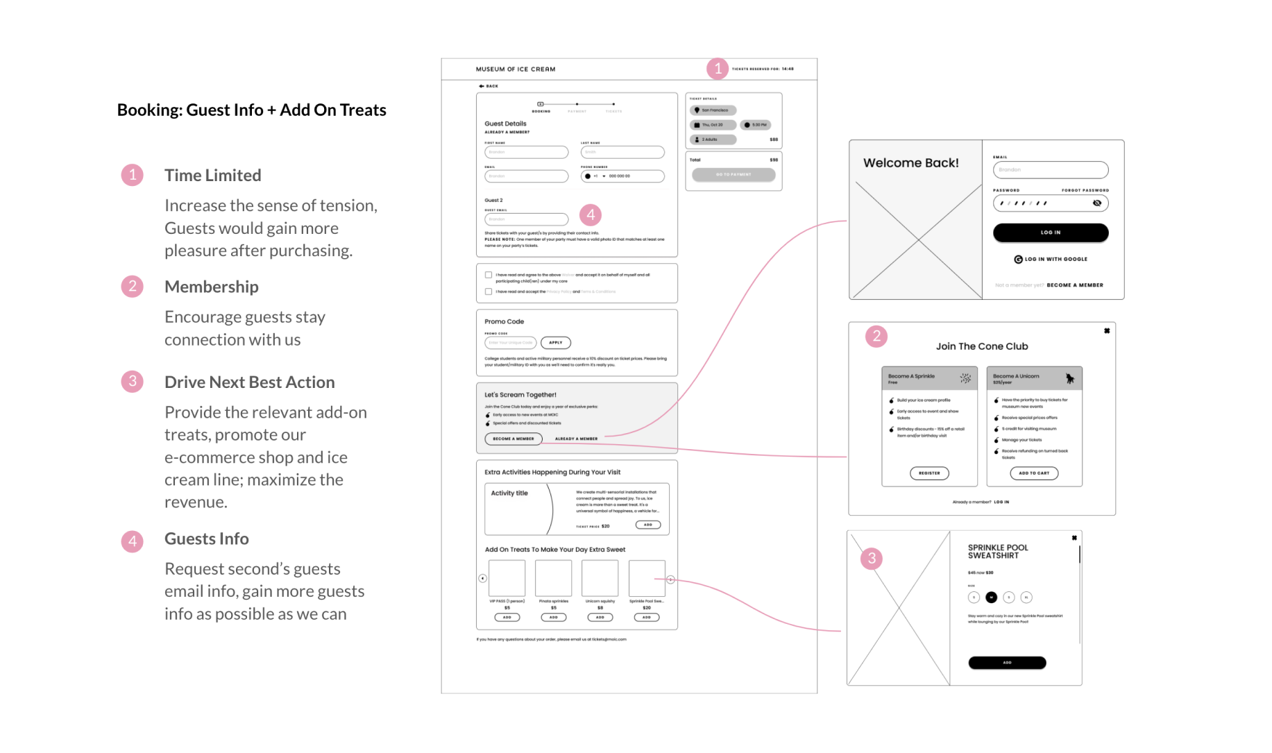
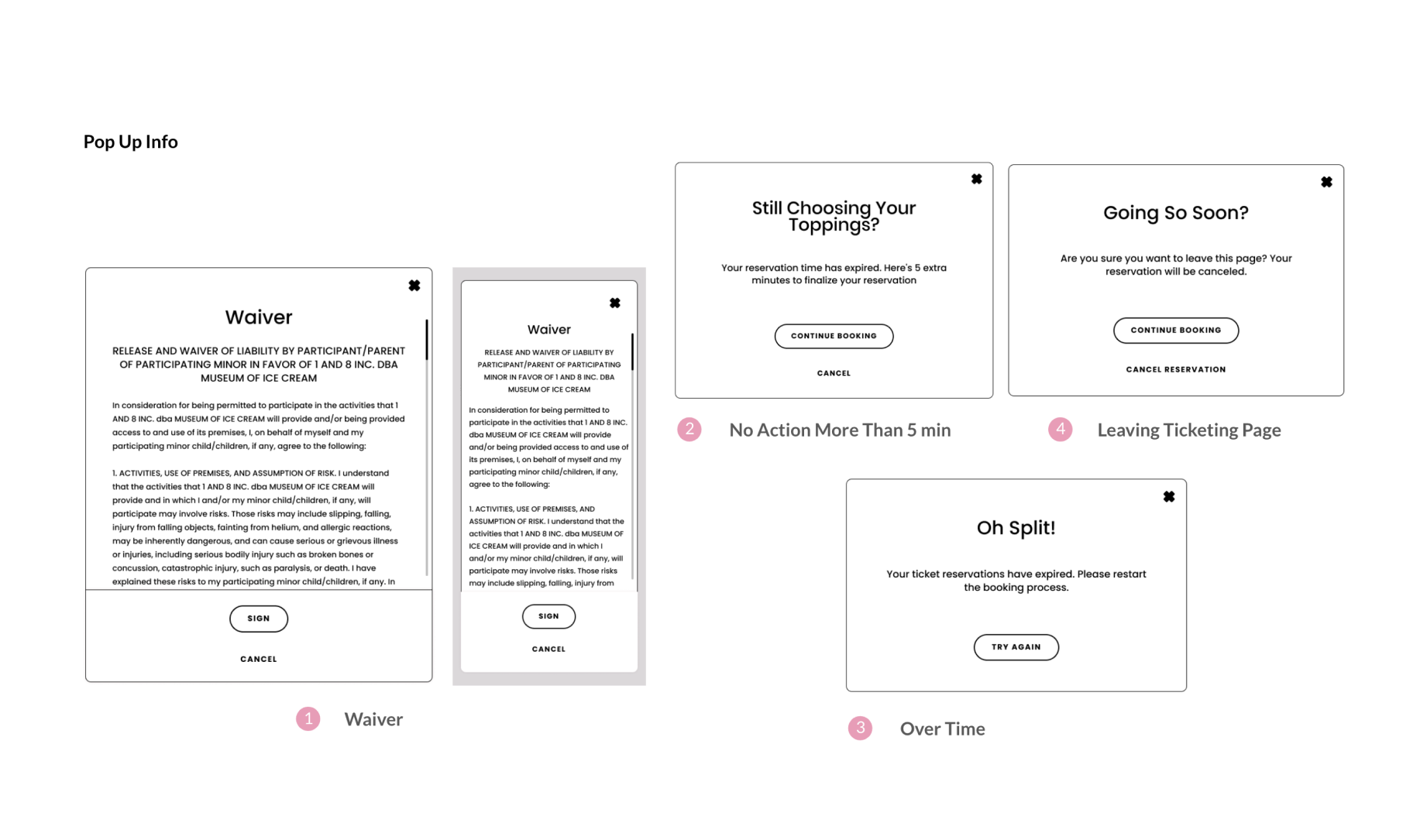
Stay Connect with Guests
Encourage guests to join in the membership program to create lasting relationship. For guests who are not buying tickets for the first time, as long as they log in, there is no need to fill in the personal information, which saves more time and makes the speed of buying tickets more convenient and fast.
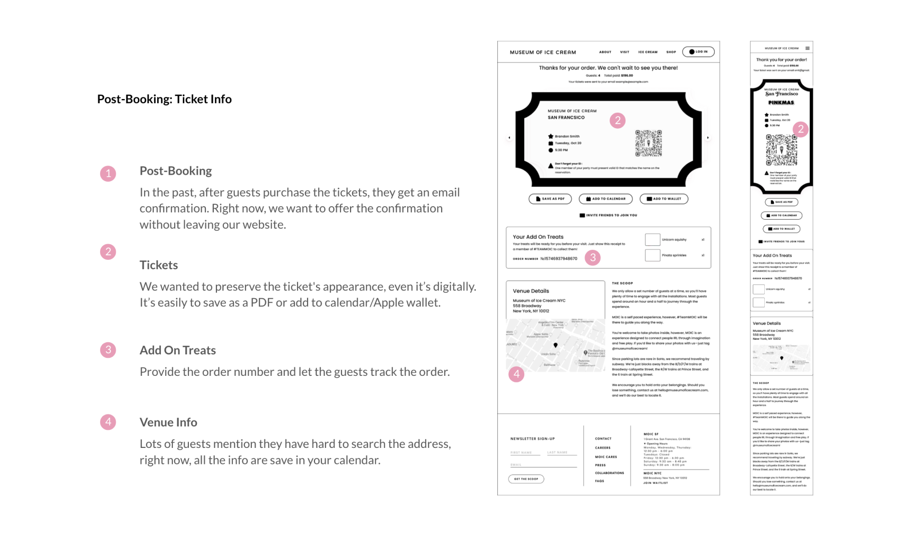
Driven the Next Best Action
Empower the transaction moment through add-on service, such as, adding relevant events to cart, promoting the e-commerce products and signing up the membership.
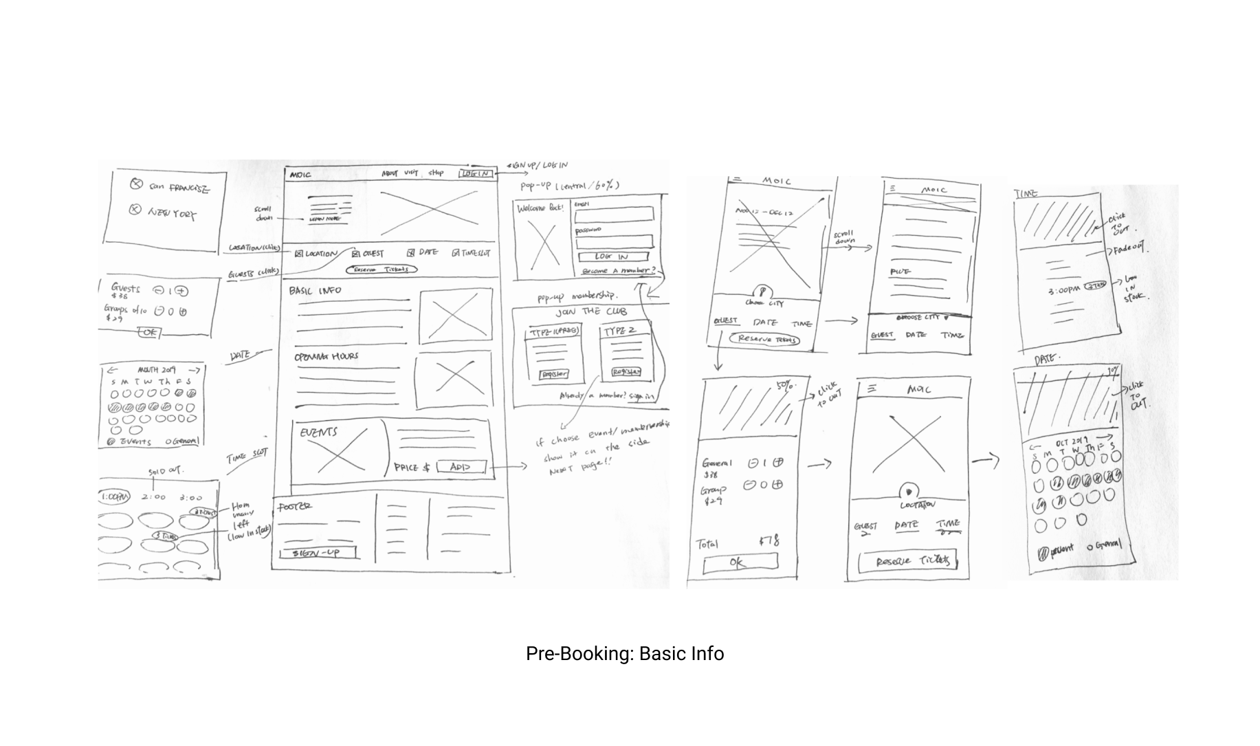
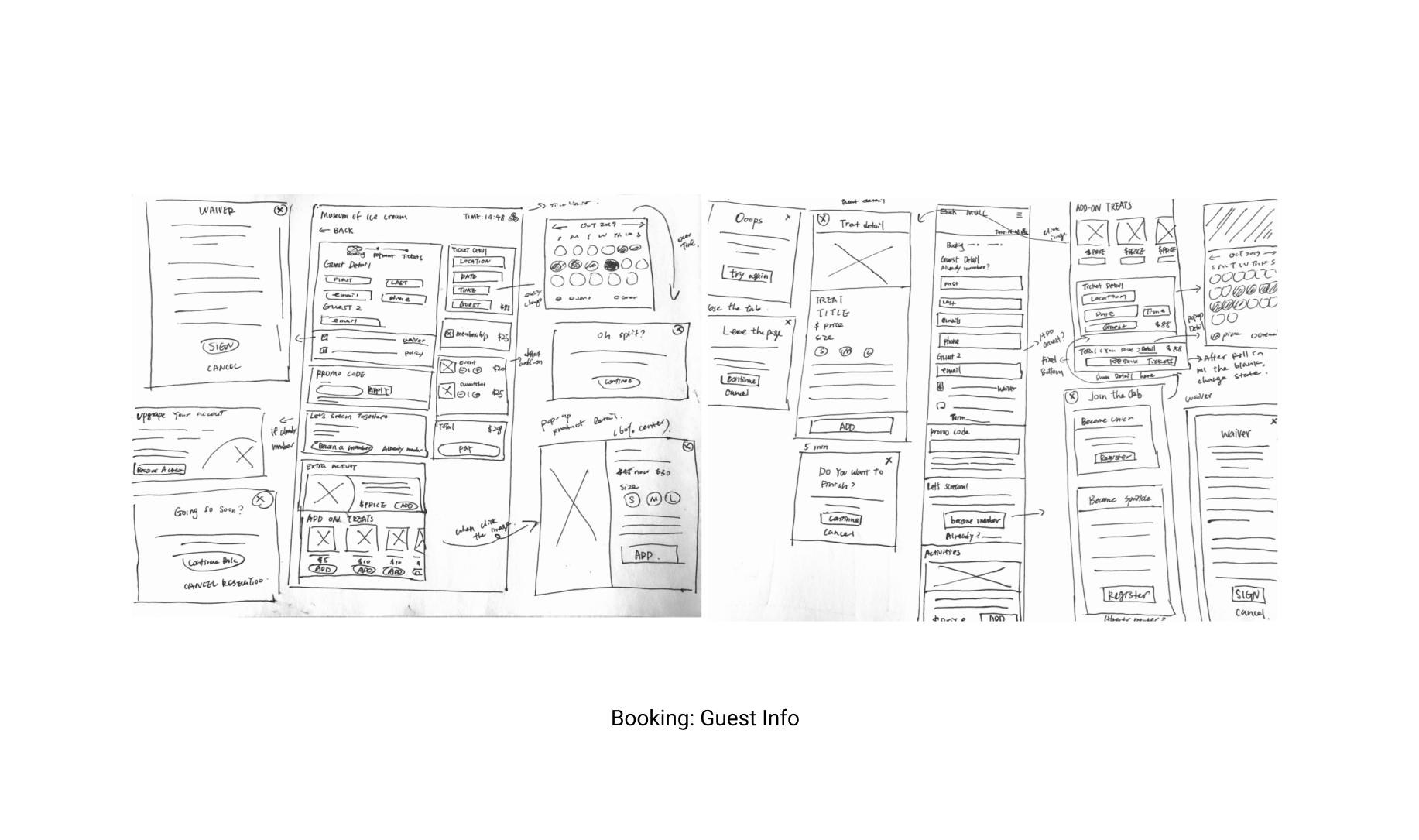
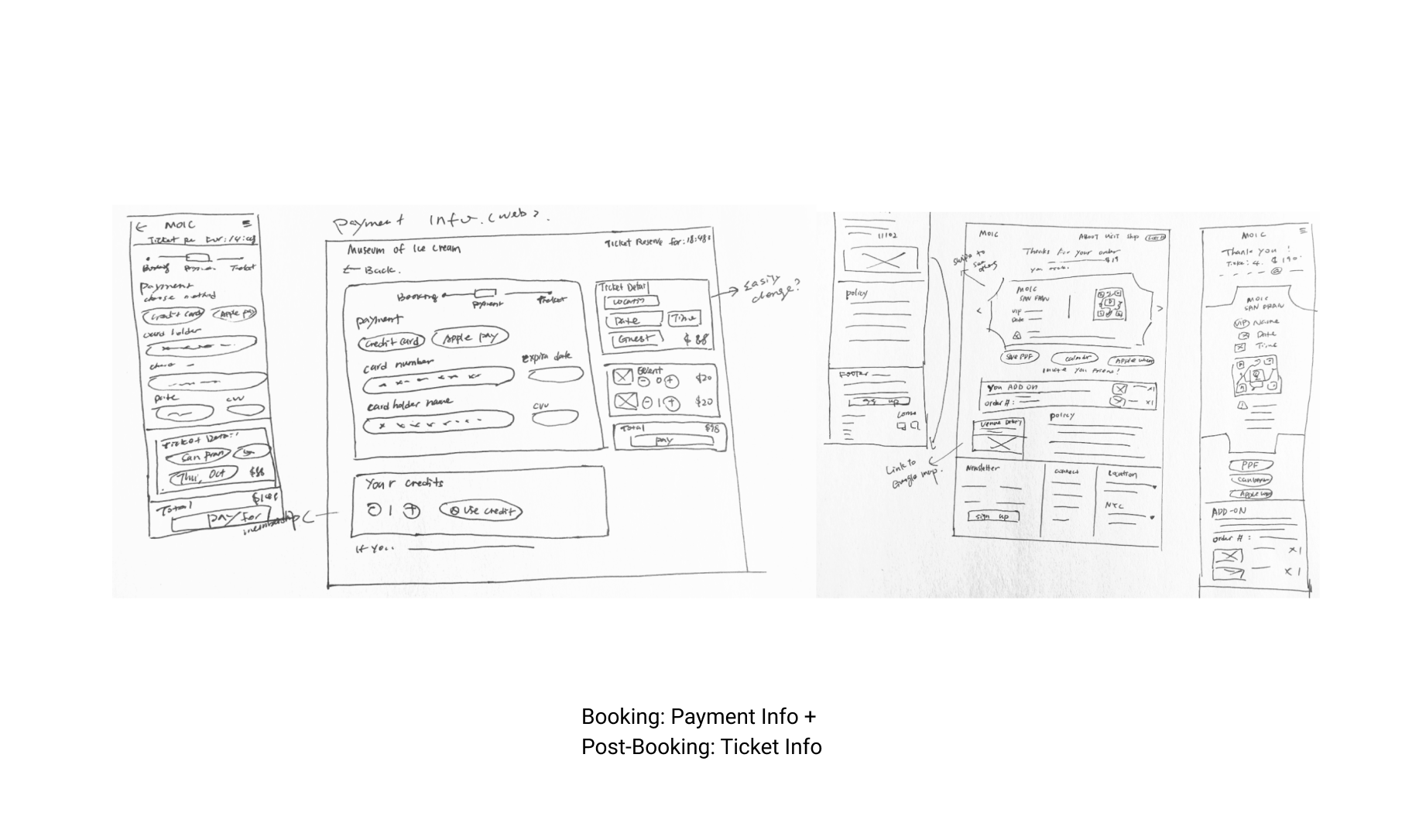
DESIGN PROCESS
Our team did not just jump from A to B, we researched on the users, considered various features and flows in creating the experience that would match our goals. We then explored various ways to representing those flows in the interface.
Information Architecture, Use Cases & Feature Flows:
Sketches & Wireframes
PROTOTYPE